Dior Spring 2026: Is Good Taste Missing in the Details?
- Maryna Borysenko

- Mar 2
- 4 min read
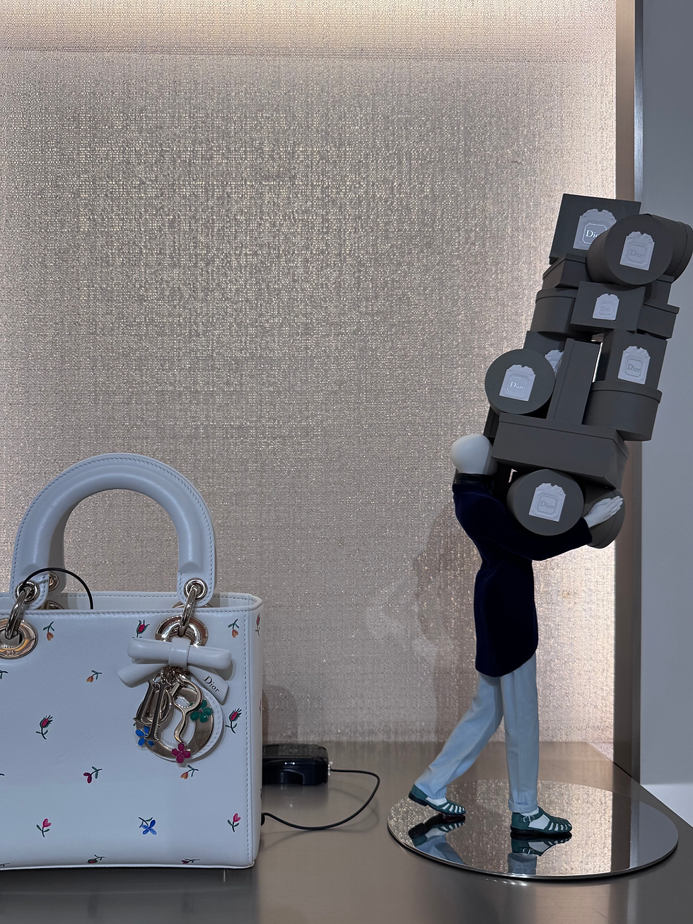
Last week I visited several Dior boutiques. Following the first retail drop of Jonathan Anderson’s debut collection in January, the shelves have recently been replenished with a second delivery.
1) The key mistake the brand made when launching the first drop in boutiques was triviality and lack of focus.
Several directions were presented at once, many of them very down-to-earth. Basic pieces have a place in any brand — in fact, they ensure commercial viability by appealing to different types of customers. However, in the case of the first drop, their abundance meant they were perceived as the embodiment of Jonathan Anderson’s direction itself. First impressions cannot be created twice, and the boutique offering effectively became that first impression.
Instead of launching a little bit of everything in early January, the brand should have focused on the Book Edition as a clear starting point — supported by obvious accompanying categories such as bags, tops, and knitwear. A stronger narrative anchor at launch would have allowed customers to frame the launch as a themed capsule without being disappointed by it as an actual new vision.
2) With the second drop, everything feels considerably more interesting.
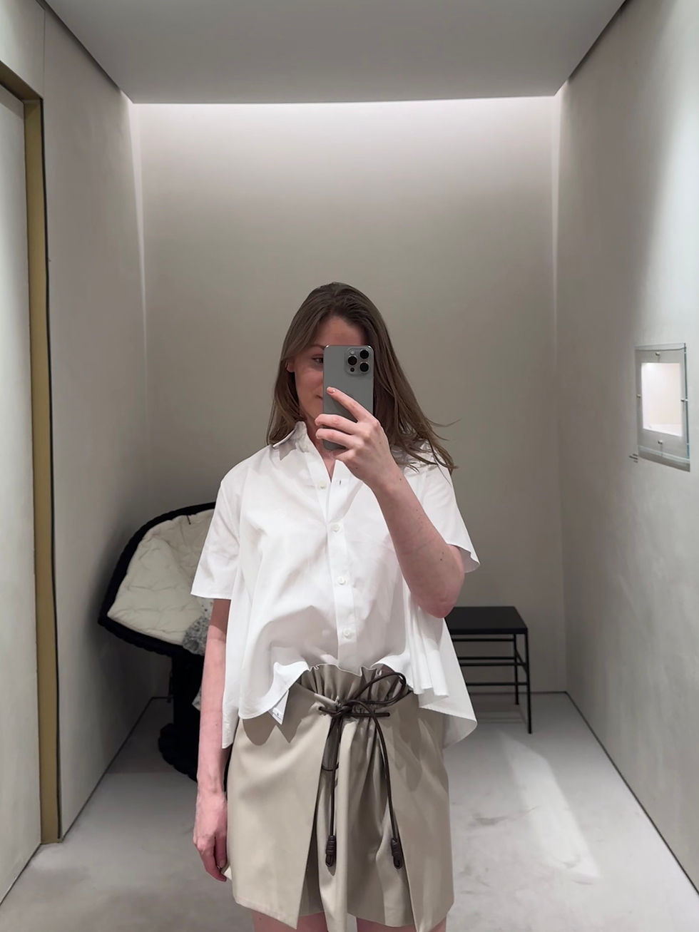
This delivery reveals Jonathan Anderson’s proposal much more clearly. There are still multiple directions present, but they now feel more balanced in their visual weight. Alongside fairly flat logo-coded pieces, there are more complex garments that remain wearable in real life rather than existing purely as editorial statements. I spent quite some time admiring a beaded embroidered skirt and a white taffeta dress with painterly floral washes.
That said, several decisions still noticeably undermine the overall impression.
3) When the first drop appeared, I wrote about the questionable decision to use embroidery on knitwear.
In this type of execution, embroidery on knitwear tends to deform the fabric, making it more decorative than durable. Knit structures are inherently elastic, while embroidery introduces a rigid stitched surface; without knit-specific engineering support, tension differences can gradually distort the material over time. In the current drop, another flashy-coded item appeared — the “No Dior, No Dietrich” sweater.

I turned the sweater inside out in the boutique and noticed that the embroidery was applied without stabilisation, at least beyond the immediate stitched area. Cashmere — the material used for the sweater — responds strongly to water during care, which makes this execution even more questionable from a longevity standpoint. At luxury price points, construction details inevitably become part of perceived value, not just technical nuance.
If the intention was to create a statement piece, the text would have been more appropriately integrated into the construction itself — for example through contrasting white cashmere using an intarsia or engineered knit technique rather than applied embroidery.
4) Window styling should demonstrate craftsmanship, good taste, and a compelling story.
If a construction with a visibly distorted back is presented as an example of craftsmanship, will a client feel invited to enter the store? I did not try on the jacket displayed on the right mannequin, but the issue points either to the cut and tailoring itself or to display construction problem — in either case, it weakens the first impression already at the entrance.

Leaving aside the central mannequin positioned behind the glass in an extremely unnatural pose — one that looks more suited to professional dancers or gymnasts — the larger question becomes one of taste. As far as I know, Dior window styling is centrally approved, which makes these choices feel less incidental and more systemic.

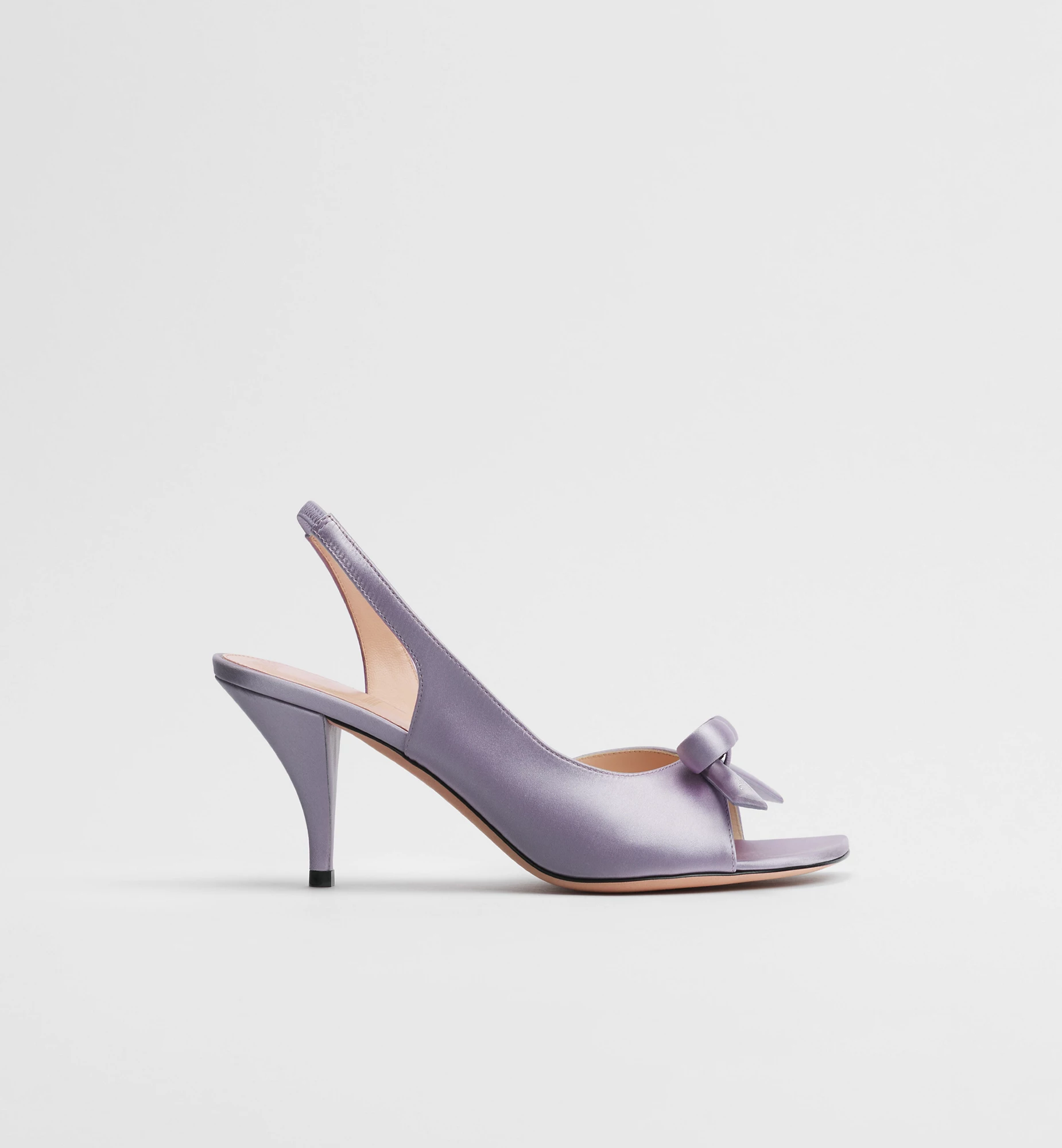
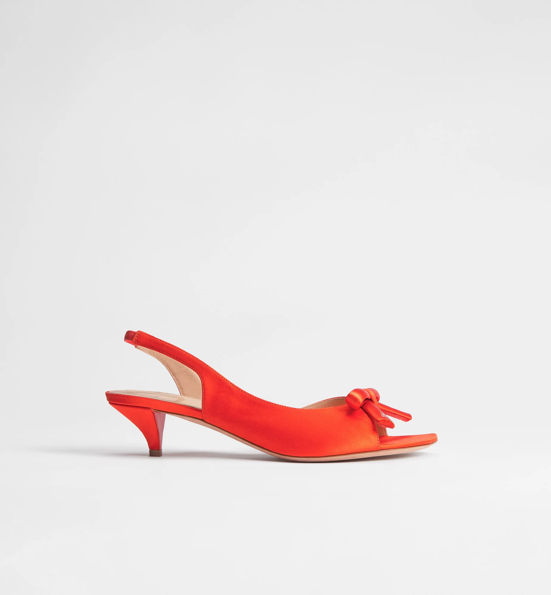
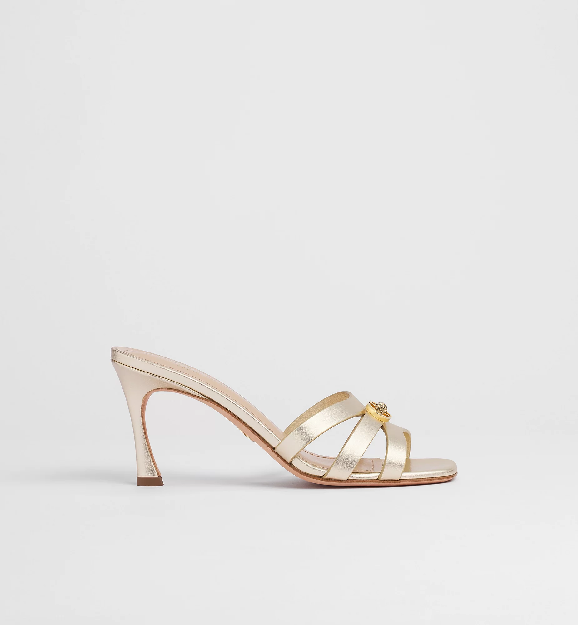
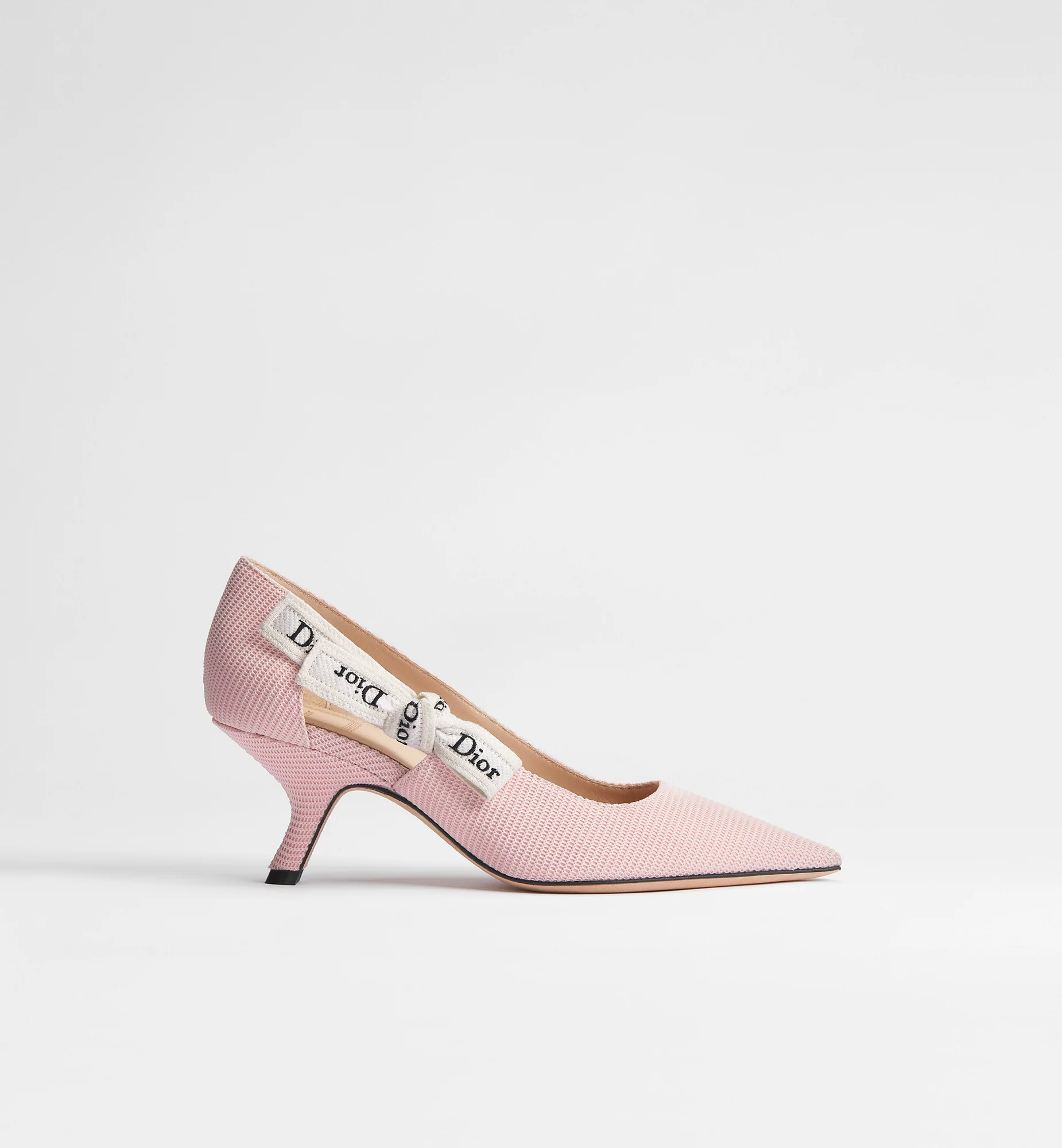
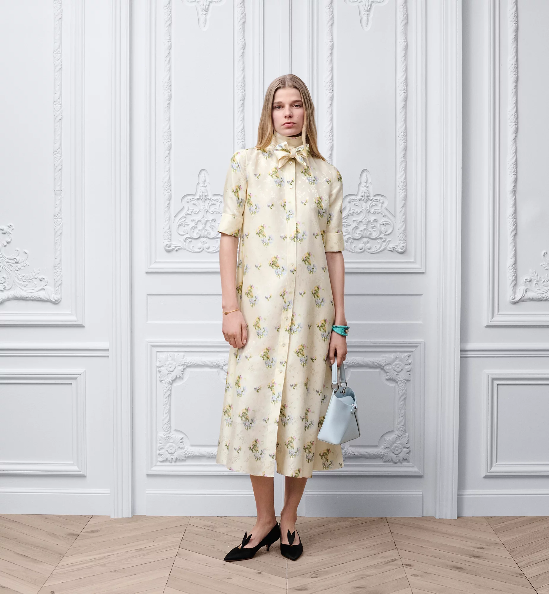
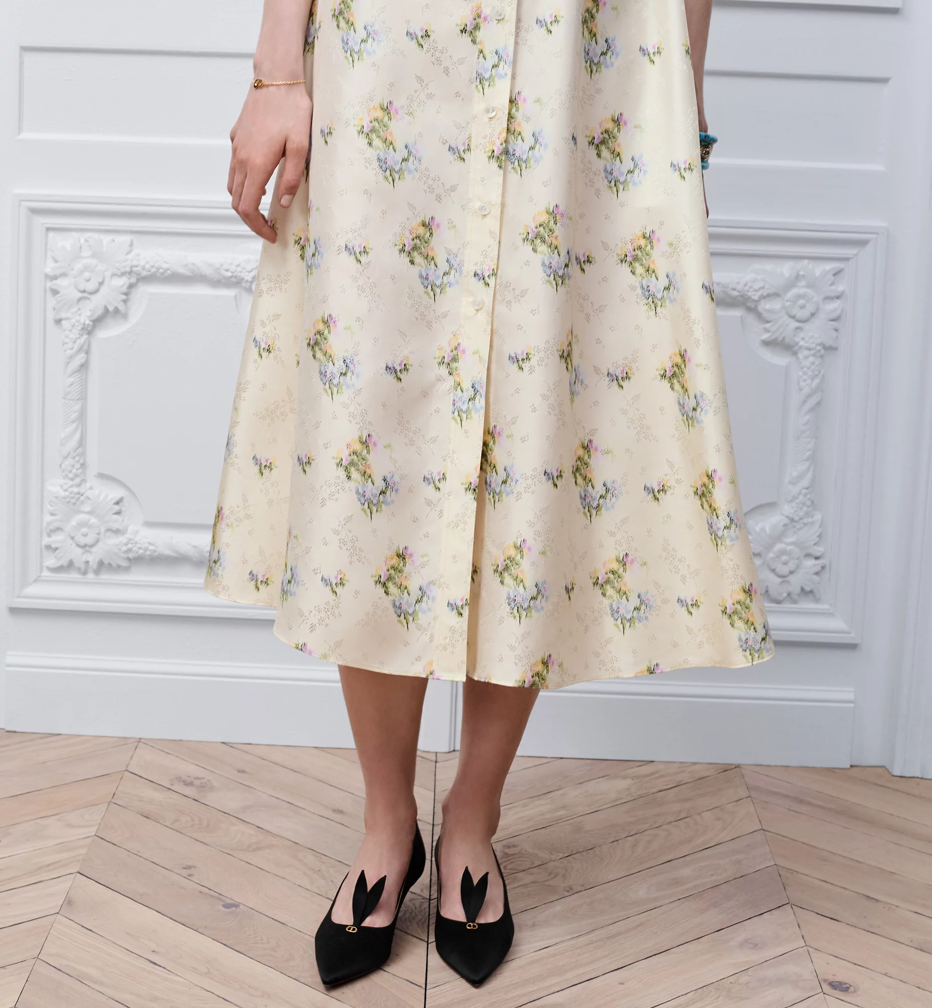
A beautifully light spring dress in an exquisite print was paired with shoes completely mismatched in both colour and proportion, as well as with a bag far too heavy for the delicacy of the garment. Bow sandals — potentially in a contrasting satin shade such as orange, or in tones drawn from the print like lilac or pink — would have supported the look far better. Newly landed Dior Or 30M Heeled Slides or re-imagined J'Adior Pump in Rose could also have worked. For a more relaxed contemporary interpretation, even sneakers might have been appropriate, provided the dress was layered accordingly. The bag should likewise have been replaced with a lighter option, such as the Bow Bag or the Small Dior Toujours Vertical Tote. Avoiding repetition across mannequins would naturally require reconsidering adjacent looks as well — but that is precisely where strong styling direction becomes visible.


Fun fact: when I saw the left mannequin wearing the long knitted cape, I immediately remembered how a friend once called me Harry Potter after seeing me in a similar cape. My first thought was that a shorter version would be amazing to have as an option — and later I found out that such a version actually exists in the collection. Unfortunately, the piece itself was undermined by oversized Dior embroidery, which shifted it from an interesting silhouette into a branded statement rather than allowing the form to speak for itself.

5) The online presentation differs — and not for the better.
The same dress with the print from the window appears online styled with Whisper pumps. While this pairing works somewhat better, the black version still feels misaligned. According to the product description, the dress includes a belt, yet it is absent in the imagery (being additional selling point). The Cigale bag — not yet visible on the website — would actually complement the look perfectly, whereas the bracelet once again pulls the outfit down visually.
These styling inconsistencies appear repeatedly across the site. One could analyse each detail meticulously, or simply call things by their name: the overall result lacks refinement. This effect is further amplified by unflattering shooting angles that diminish the garment rather than elevate it, weakening the product’s perceived desirability at the very moment it should be reinforced.
Ultimately, when a new creative era is introduced, consistency of execution across retail, styling, and digital presentation becomes as important as the collection itself — because for the customer, these touchpoints collectively define what the new Dior actually means.