CELINE Gets Real (Sort Of)
- Maryna Borysenko

- Sep 15, 2025
- 2 min read
Yesterday, I was browsing the Celine website. I’ve criticized both the product pages and the ordering process more than once, based on my own experience, as well as the similarity to Saint Laurent’s site.
I love the brand as a customer, not just as an observer, and that’s why I criticize it more — because I’m more familiar with it.
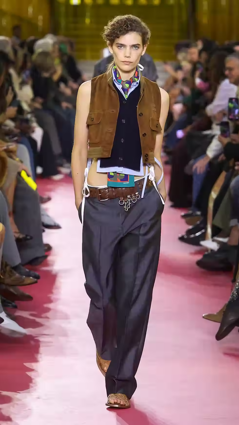
So, my main criticism had always been the absence of product photos on models in the official online store. Model photos are very important. When you see an item photographed alone, it’s often unclear how long it is, how it fits, or how the fabric drapes on the body. Not to mention how incredibly helpful proper (!) video can be — though that’s high-level, and I haven’t even seen it on Mytheresa yet.
With Celine, things were even more complicated. The brand sells online exclusively through its official store (the men’s line is available on Mr. Porter). That means you can’t look at other websites to see how items fit — something I often rely on to finalize my opinion before buying online, since I can check model photos across different platforms.
Well. Yesterday, while browsing the new collection, I was surprised to see some items photographed on models. A few thoughts on this:
• Product photos in online stores usually go to two extremes — either flat catalog shots with two standard poses (model standing straight with arms down, front and back) or overly elaborate editorial-style photos that not only make it hard to see the item clearly but are also buried under filters.
Celine, however, strikes a successful balance: their photos manage to capture the brand’s mood while still looking realistic enough that you can almost feel the texture, with a touch of French bourgeois charm — in other words, they reflect the brand’s spirit.


Is one photo of the item, sometimes with cropped shoulders so you can’t even see the full piece, really enough? Definitely not. But it’s a solid start and quite a good one.
• The product pages still don’t connect with customers across all possible touchpoints — meaning the work on structure remains on the to-do list.
I also found the layout of the collection pages interesting, something I’d take note of.
If you go to the “New” tab, the rows of products on the desktop version are arranged logically. For example, in one row you’ll see a bag, RTW items complementing each other, shoes, accessories, jewelry, and even cosmetics. This way, the customer can immediately form a complete look around a certain piece. LOEWE does something similar on their site, and both brands use the same approach in their catalogs. I would additionally reinforce this with model photos showing the full look.


In the “New – Clothing” tab, however, items are already sorted by category. That makes sense, but I’d still arrange sets (like here there are two jackets with two matching skirts) next to each other.

I was surprised to discover a “Fine Jewellery” section. These are classic costume jewelry designs, but made in precious metals and diamonds.