Spotlight on e-Commerce Gaps: Loewe
- Maryna Borysenko

- Jul 1, 2025
- 3 min read
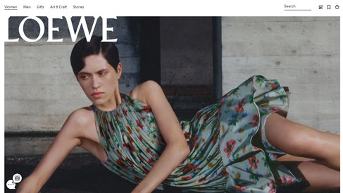
In a series on e-commerce gaps using concrete examples, let's talk about Loewe. The brand has done a solid job on its website, and I’ll mention a few techniques worth noting. This time, I’m covering a topic I haven’t addressed in previous posts from this series—the collection page in an online store.
I recently did numerous fittings for my unretouched digital lookbook platform 2Jour-Stylist.com, where—apart from try-ons—I analyzed the online vs. offline experience as well as the overall omnichannel journey.
Loewe genuinely surprised me. I had a fairly fixed impression of their RTW line, and in terms of personal preference—it’s either not for me or only selectively so. This current collection feels not only fresh, but also thoughtfully positioned between commercial and artistic. With rare exceptions, I don’t like pieces that come with built-in complications: how to wear them (because they’re too sheer or impractical etc.), how to care for them, etc. Loewe's fit is excellent, and their pattern work is considered.


But back to the point.
As I’ve often mentioned, every page of a website should work to its full potential—you never know how a client will land on a product page. It might be directly from a search engine or after exploring several site sections.
What I liked about Loewe’s collection pages:
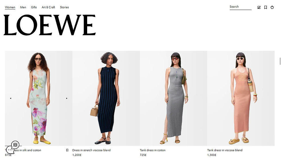
In sections dedicated to updates (i.e., where products aren’t part of a single defined category), the site shows a logical sequence of items from the same look—creating a cohesive outfit suggestion.
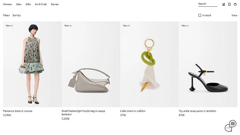
This is a technique Loewe also uses in their catalogs, which are among the best of any brand—a seriously underrated engagement tool.
This approach increases the potential for upselling.
What doesn’t work as well:
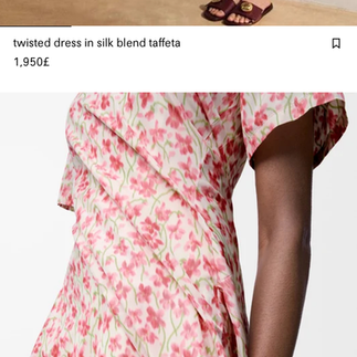
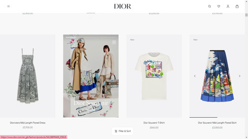
On collection pages with specific categories, Loewe uses a custom layout where the product grid is broken up by larger feature images. This isn’t a new idea—Dior and Hermès use it too—and overall, I like the intent. It allows certain items to be highlighted. However, with formats like this, it’s important to test usability across devices—desktop, mobile, and tablet.
In Loewe’s case, the featured product images didn’t fully fit on my 15-inch monitor. On mobile, the highlighted items appear one per row.


For better visual flow, I’d recommend displaying two items per row instead on mobile. For desktop, I’d follow the example set by Dior and Hermès, who adapted their layout more carefully for browsing ease.


Another issue is the size of the Loewe logo. It’s quite large—and few things frustrate users more than a logo covering half the product image, especially on individual product pages (hello, Louis Vuitton).
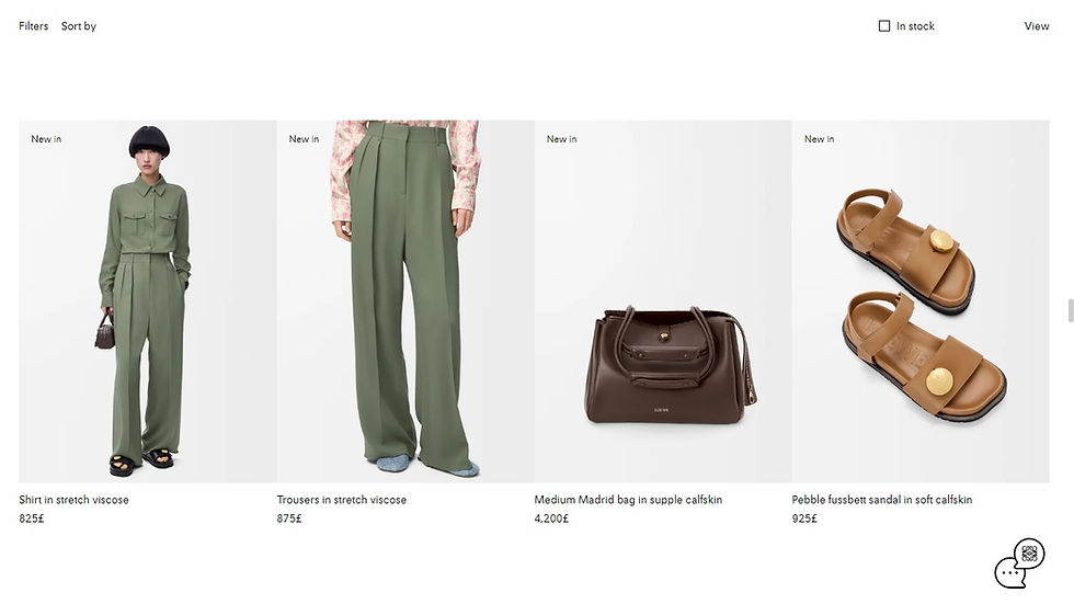
Filters are underdeveloped. Only color and size filters are available. Depending on the product category, additional parameters—like length, cut, or style—could greatly improve the shopping experience.

For example, on 2Jour-Concierge.com, we let users filter storage baskets by shape and size. We introduced this after repeatedly receiving requests from clients who needed pieces to fit specific interiors.
Fashion clients might not reach out to ask for a filtered list of dresses matching certain criteria—but that doesn’t mean they aren’t searching for it. And if that search becomes too time-consuming, they might simply give up.
In e-commerce, capturing attention is only the first step. Retaining it is just as important.
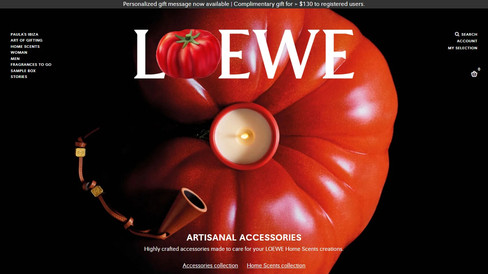
P.S. Given that Loewe Perfumes operates under the Loewe umbrella (and not under a beauty license owned by an external company), I believe it was a mistake to separate the fashion and beauty segments into two distinct platforms.