FENDI e-catalogue: idea overview and gaps to consider
- Maryna Borysenko

- Aug 18, 2025
- 3 min read
Some time ago, I received an email from a Fendi Client Services advisor with a link to the brand’s online catalogue. The idea felt new and somewhat different from what I’d seen before, but it does succeed in bringing the advantages of catalogues into the digital space.
I’ve written quite a few publications on catalogues in luxury fashion. I consider them a powerful (though often overlooked) instrument in brand–SA–client communication. While requiring relatively low investment (if not zero), they remain an effective way to engage the target audience, grow sales, and even predict demand.
It’s important to note that I’m not entirely sure how the brand representative obtained my data (especially since it’s been quite a while since I last placed an order on Fendi.com). I tend to be protective of my personal information both in boutiques and online/offline, so this point stood out.
Anyway, let’s take a closer look at Fendi’s online catalogue.
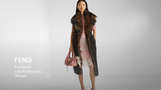
Email with link. I received an email from a Fendi Client Services advisor containing a link to the lookbook.

Gap: the picture itself was clickable, but it would be better to highlight this with an underline or a soft CTA such as “Click to view”.
Landing page. The link leads to the official website, where you arrive at a full-screen grid of editorial-style outfit photographs.


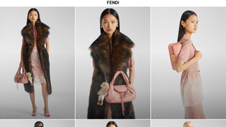

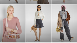
Outfit details. Clicking on any image expands it to show outfit details — including item name, code, and color. Integrated navigation allows you to return to the grid or continue browsing outfit by outfit.

Gap: it would be useful to add a short instruction at the top of the lookbook, such as “Click on an image to see more details”.
Product pages. Clicking on an individual product within an outfit expands to show further details. In many cases, there is an integrated link to the product page on the official website. However, if the item is unavailable online, you are redirected to the homepage.


Fendi’s implementation of the online catalogue is at a fairly high level, and this example could serve as an excellent template. Still, I noticed several areas for improvement:
Narrative element missing – The lookbook feels somewhat raw, with no storytelling. Storytelling is essential in luxury; even a short note on the collection concept at the start of the grid would elevate the experience. A “high-level” addition would be including a behind-the-scenes or moodboard section at the end of the grid, so as not to distract from sales but still enrich the brand message.
Access & tools – It would be stronger to provide lookbook access only after client login, linked to the email invitation. Additional tools would also be useful — such as a wishlist or “save for later” function, since many clients need time to reflect before purchasing.
Lack of human touch – The biggest gap is the absence of a sales advisor in this communication, creating a sense of depersonalization. This is often seen as a threat to luxury in the online sphere. While I partly agree, I don’t think it’s impossible to integrate this part. In this case, it would be important to include the contact details of the same Client Services advisor who sent the email — ideally with a “Contact Your Advisor” button naming that person. Technically, this can be tracked through referral info in the email or updated in the client’s account if the lookbook is accessed via login. For reference, Dior provides a good model for such integration (I’ve written separately about my Dior offline boutique experience and communication tools used by advisors with their clients here).