Dior Man Spring 2026: Online Presentation Gaps, Missed Opportunities & Solutions For Better Sales and Omnichannel Experience
- Maryna Borysenko

- Jun 29, 2025
- 2 min read
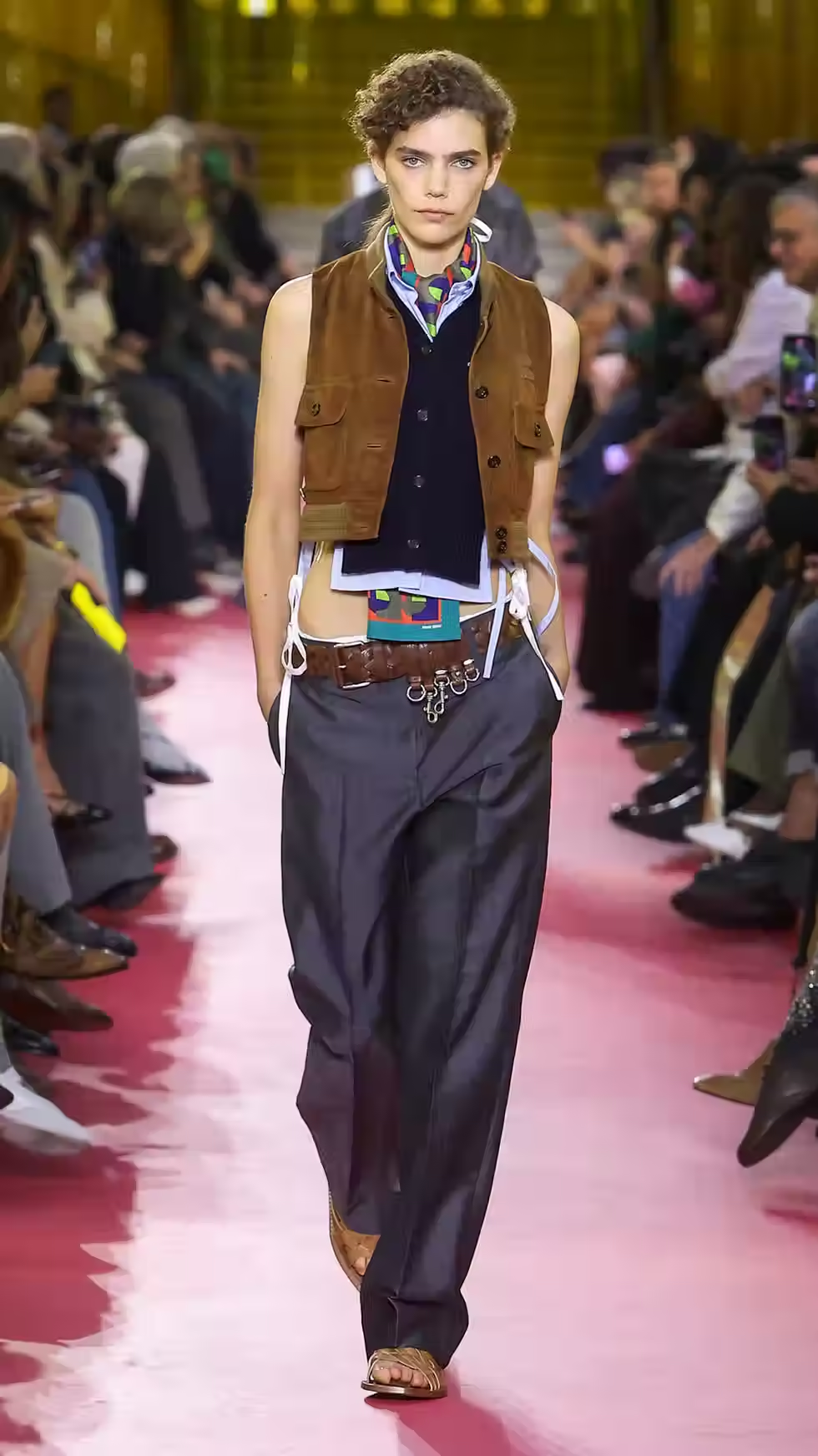
Few days ago, Jonathan Anderson presented his first collection for Dior Man (and some female guests even gave hints at the upcoming women’s collection—it reminded me a bit of Raf Simons’ era).
Let’s talk about how the brand packaged such a major event on its official website, and what opportunities it missed—both in creating a full omnichannel experience and in potential sales.
1) The homepage is fully dedicated to the show — including video, photos, and an additional directory of editorial-styled content about the collection and inspiration motifs. Excellent, well-structured layout.


2) On the homepage, there are two CTA buttons — Discover and Explore more.


3) Both lead to the same page about the show. That page partially duplicates the homepage — repeating the show video and the collection looks. In addition, it features a more extensive description and added sections with visual content about details and savoir-faire.


4) On that same page, there are two links to subscribe for notifications:
*when the collection becomes available online


*when the updated Dior Book Tote is launched online


Gaps:
1) Unclear CTA value and duplication
Since the homepage already presents quite extensive information, and also because the CTA buttons are not clearly highlighted or carry a specific message — there’s a high chance that visitors won’t proceed further
2) Missed conversion trigger
Why is it important for the client to go further? Because on the second page, there’s a tool to convert interest into a sale — the sign-up for product launch notifications
3) Inconsistent form experience
The notification forms left me slightly puzzled: one requires name, surname, and email, while the other only asks for email.
Solutions and further ideas:
1) Simplified homepage with focused CTA
A clean banner without detailed collection content, paired with a single button like Discover the collection. Avoid overloading the homepage, as a dedicated collection page will remain live for a period of time.
2) Unified and personalized forms
Standardize the sign-up format with a name field to allow for personalized emails. Include one essential checked checkbox for collection or product updates and one optional for brand news, giving clients flexibility without losing interest signals