Label Approach in Bottega Veneta Product Presentation (+ further ideas)
- Maryna Borysenko

- May 1, 2025
- 3 min read
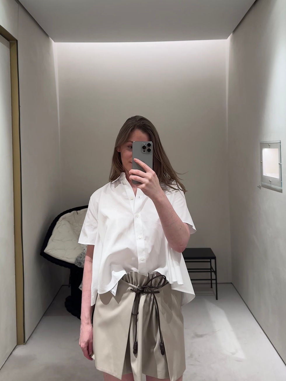
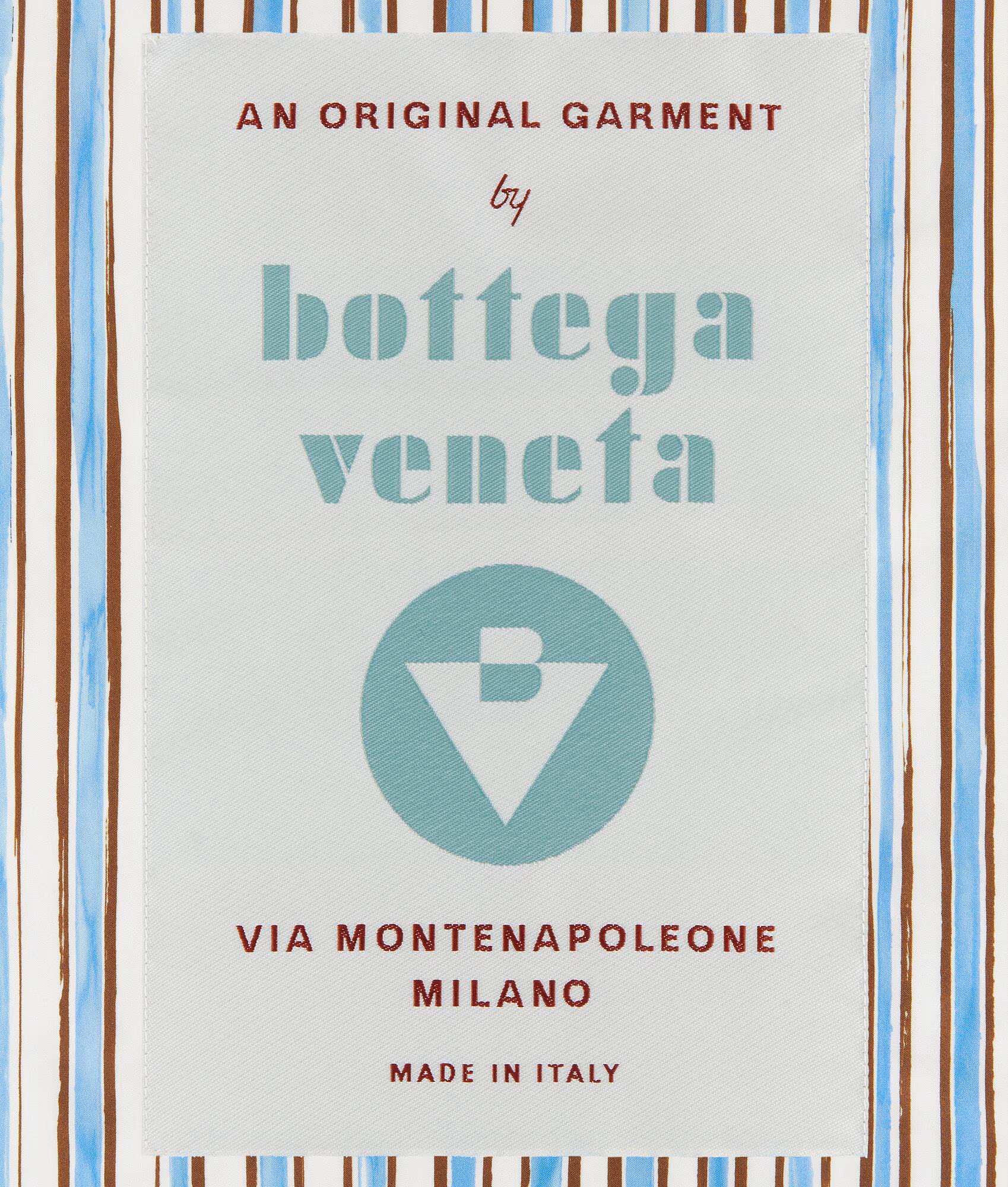
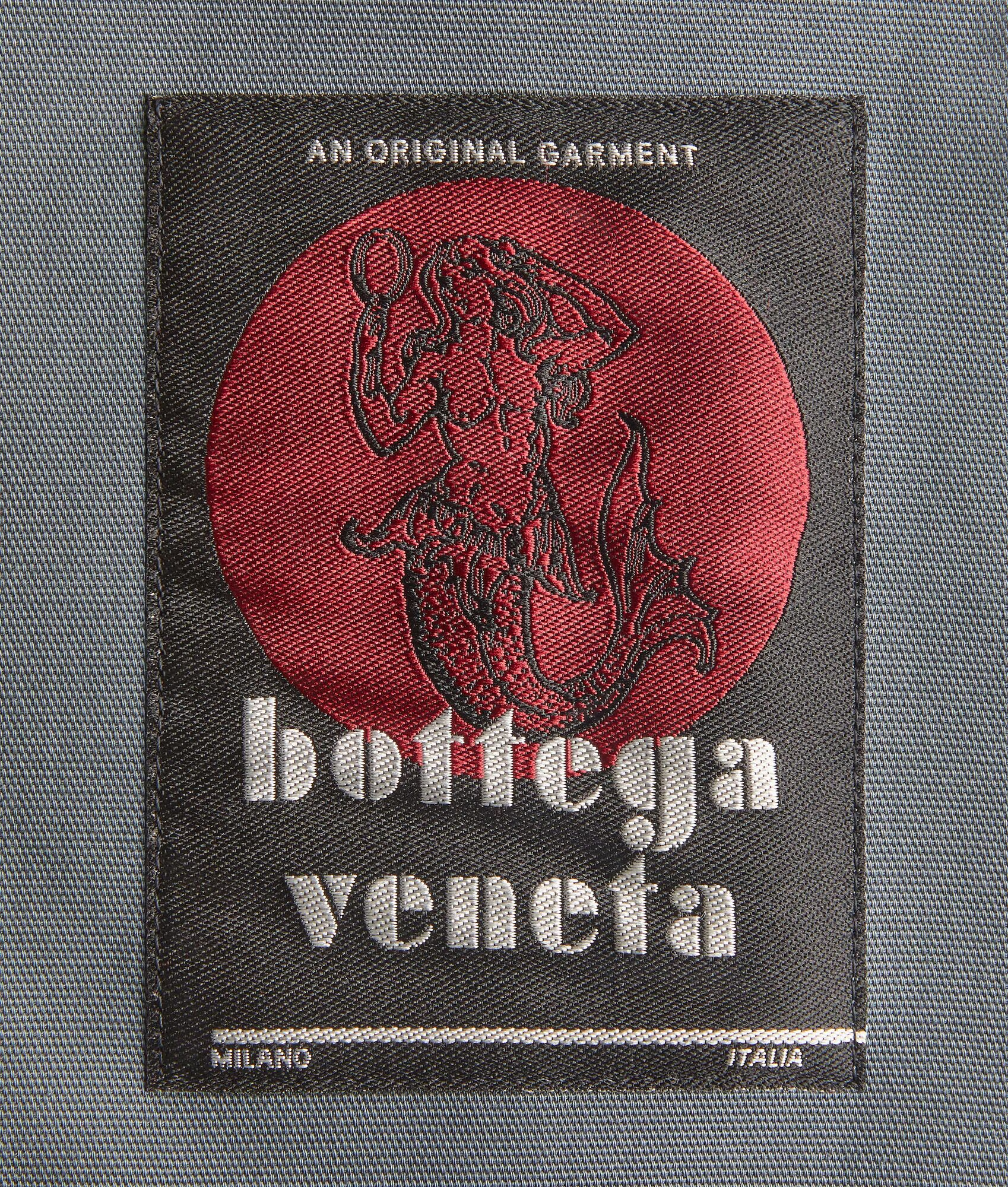
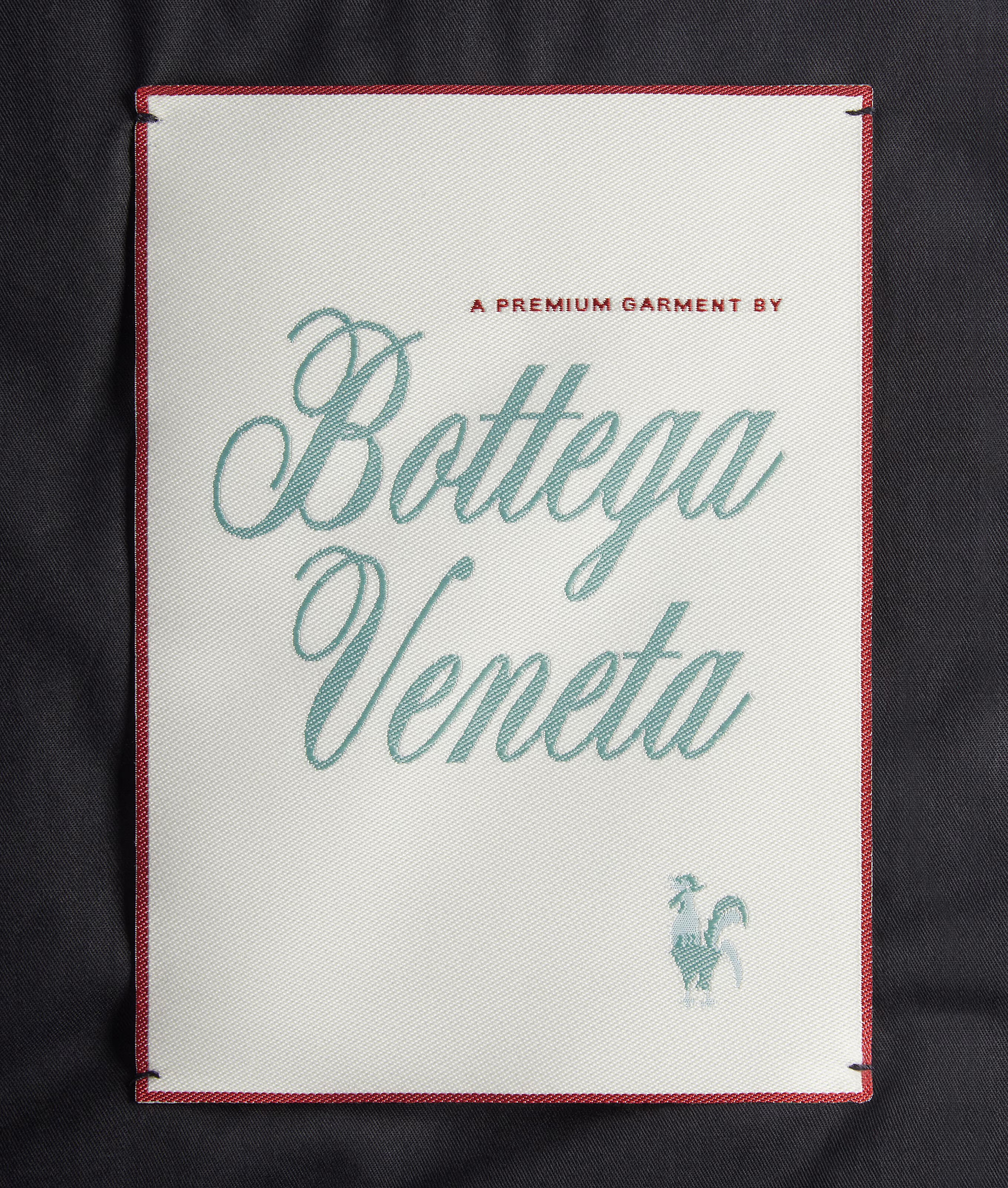
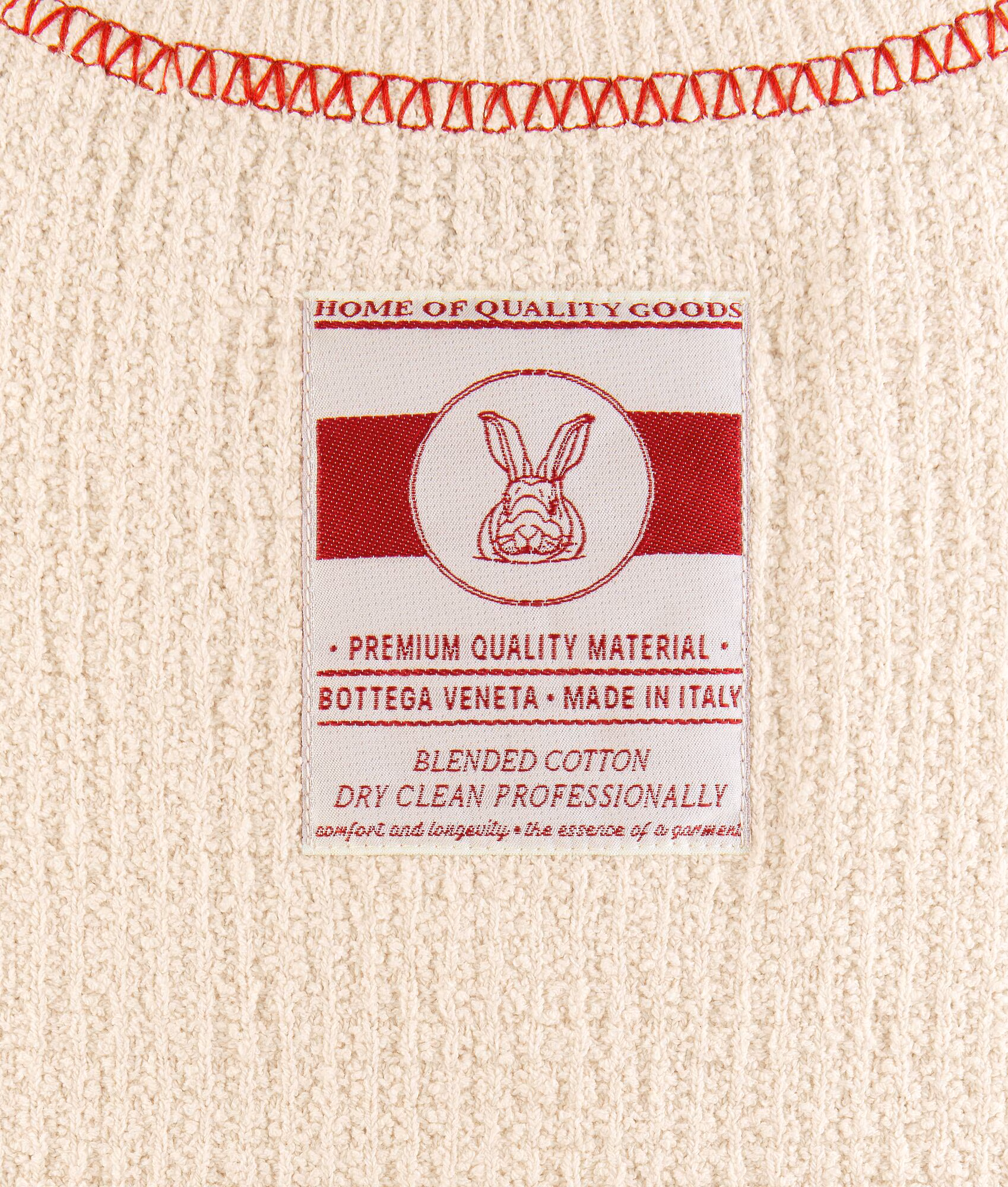
The other day, I noticed an interesting detail about Bottega Veneta’s current collection: many RTW pieces have unique tags. They strongly resemble those found in small Italian workshops and perfectly reflect the brand’s name (Bottega, by the way, translates to "workshop," and Bottega Veneta means "Venetian workshop"). Some of the labels even feature Matthieu Blazy’s dog.


I wanted to check out these labels in-store myself, but that experience was quite limited — as I mentioned here earlier, there was practically no clothing from the current collection available, and what little there was had been tucked away in such a remote corner that I only found it because I came in with a specific purpose. So I only have the website photos.
More broadly, the concept of using distinctive labels hasn’t been widely explored by other brands, except for those who recognize the value. Once, I featured a photo of archival tags from Le Monde d’Hermès magazine on the cover of 2Jour Gazette, as the main theme of that edition was Hermès’ financial results. There are even websites where you can spend hours studying archival labels.
Why are different labels within a single collection such a great idea?
Creating an “archive within an archive”
These labels are often designed in an archival or collectible reinterpretation style. It’s not just visual — it’s a play on the aesthetics of past decades, as if each label references different fashion eras, the streets of Milan, or the style of vintage brands.
Collectible value
This approach gives the impression that each piece is unique. It’s not just clothing — it’s almost an art object. Some fashion enthusiasts even collect these labels. This strengthens the customer’s connection to the brand and fosters a sense of belonging to an “inner circle.”
Emphasizing a creative approach
Different fonts, crests, and illustrations (mermaid, rooster, Matthieu’s Labrador, the "B" inside a triangle) serve as elements of a visual language that functions almost like art direction. They say, “we are visual storytellers.”
A manifesto of “non-branding”
Interestingly, Bottega Veneta has long avoided (and still does) using loud logos on the outside of garments (which is one of the reasons I personally appreciate the brand — remember their campaign: "Your own initials are enough?"). These varied labels become a subtle way to make a statement — hidden signs for insiders, almost like passwords. This highlights both exclusivity and conceptual depth.

Strengthening local identity
Many labels reference Via Montenapoleone — the legendary fashion street in Milan where the brand’s boutique is located. This alludes to the brand’s roots, Italian craftsmanship, and cultural heritage.
In short, different labels allow Bottega Veneta to be experimental, authentic, and collectible at the same time, creating the sense that every item is special.
I have a few more ideas to further elevate this approach: